Topics
Comic elements in technical communication
2024-01-30
One aspect of human creation is to look back to its roots in order to build on them and, to stay with the image, to grow. If we do this in the case of comics, for example, we end up with the Codex Nuttall. A pictorial codex that is the main source of knowledge about “Eight Deer Jaguar Claws”. About this important prince of the Mixtecs, a people in what is now Latin America, you can read a dynastic history in the codex, which can be used to trace lines of rulers through the centuries. Read? Well, “writing” was done with pictograms and ideograms. The panels were “read” in zigzags from right to left.
As another example, long before Cortés began collecting comics, we could look at the Bayeux Tapestry. At just over half a meter high and almost 70 meters long, it tells the story of the conquest of England by the Norman William the Conqueror in 58 individual images (in comic book terms, we would say panels today).
Enough of the very deep roots, let’s jump into the 19th century to Wilhelm Busch. Due to the short distance in time alone, his aesthetics and form of representation are much closer to us and we have less difficulty reading the picture stories, or even being inspired by them. Let us think, for example, of how Busch illustrated the explosion of teacher Lämpel’s pipe in “Max and Moritz” 4th prank. This cannot be unfamiliar to any of us.
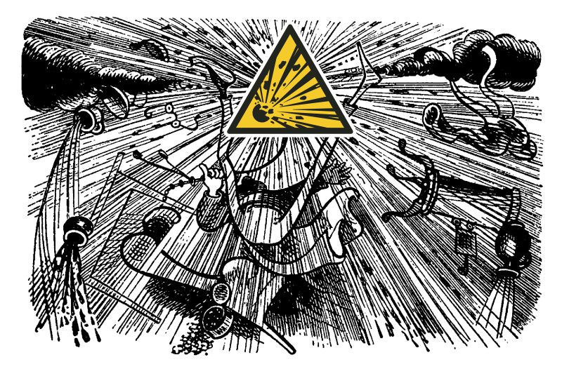
Teacher Lämpel’s exploded pipe reaches into our days
Sources: www.wikipia.com and ISO 7010
Our stereotype of comics is not directly related to historical preservation of current events or anything like that. The direct father of our comics is the comic strip, 3 to 4 panels in a strip and the message is sent. At the end of the 19th century, these short stories appeared in American Sunday newspapers. Individual strips became series, series became sequels, and then individual issues or entire universes. The origin of the term “comic”, meaning “funny”, is far too narrow today. In the 1980s, the term graphic novel emerged for complex but often not at that funny visually told stories. Graphic novels tell distinctive stories with an individual visual language. Here one simply has to mention ” Mouse” by Art Spiegelman. In this graphic novel, Spiegelman tells the story of his father, an Auschwitz survivor, in black and white in the style of an underground comic. None of this helped, comics were generally classified as trash. Extensive social and legal campaigns attempted to protect mostly young readers from brutalization, loss of reading skills and general stupidity. They ranged from rather harmless exchange campaigns (10 trashy books for 1 x high culture) to book (comic) burnings in the 1960s that were forgetting history. In the meantime, comics could almost seem intellectual with all the things that are falling over us online. Cultural development is not lacking in irony.
So what do the small selection of historical “comics”, their current appearance and our implementation in technical communication, for example in assembly instructions, have in common? They are all ” Zu räumlichen Sequenzen angeordnete, bildliche oder andere Zeichen, die Informationen vermitteln und eine ästhetische Wirkung beim Betrachter erzeugen.” (Scott McCloud). The great thing is that this definition is absolutely neutral in terms of style and content. Its author Scott McCloud, who in his books always argues for the universality of the comic medium, would not have wanted it any other way. This universality is the reason why we can still read a Codex Nuttall or a Bayeux Tapestry today. Quite apart from the faded conventions of the time and the cultural differences that lie between us and the Mixtecs. It is precisely these qualities that we are also looking for in technical communication; something that can be properly understood over a long period of time. What a claim. Furthermore, the style of comics is an attempt to resolve the weaknesses of two-dimensional visual representations. These would be the representation of three-dimensional objects on a plane, properties of objects and moving objects. But it seems to be possible to achieve a kind of universality, at least from our perspective of the Indo-European language family and culture. This is made possible by the laws of gestalt inherent to us, cultural globalization and ever-evolving conventions
”Juxtaposed pictoroal and other images in deliberate sequence, intended to convey information and to produce an aesthetic response in the viewer.
Scott McCloud
Or in short …
”Side-by-side images that convey information.
Marco Jänicke
Are we all making comics now?
We have always tried to provide functional, technical instruction with reading incentives. This starts simply with a motivating layout and illustrations and continues in a more sophisticated way with storytelling and gamification, for example. An additional carrot for the user could be instructions in comic style or at least with comic elements. However, there is a significant difference between comics and technical communication in terms of commitment and target group. In contrast to comics, technical communication must keep the scope for interpretation as small as possible, depending on the target group. Specifically, we have two options: Inspiration or adaptation. In each case, the basis is to analyze and understand the range and conventions of comics.
Styles in comics
In comics, text is used for dialogues, storytellers, interjections and onomatopoeia, all finely and individually marked with font, color and much more, similar to what we know and use in our field. But not only the text itself is visually distinguished, but also its container, the speech bubble in general. A speech bubble without reference to a person is practically information from the off, for us, for example, information from the manufacturer. Very technical information could appear in rectangular speech bubbles and acute information (“Attention, vessel is permanently pressurized to 200 bar.”) in jagged speech bubbles. While we try to keep text out of illustrations for reasons of efficiency, in comics it is often an essential part of the panels and is actually a solvable problem with the SVG format.
Onomatopoeia could be useful for us. This is the linguistic imitation of non-linguistic sound events, e.g. “click” when something snaps into place. This allows us to give the user feedback on how successful the action was. But what about language-neutral instructions? Well, how about, for example, testing “click” for some kind of universal applicability in different languages. If the target countries of the instructions are known, for example with DE, EN, IT, SV and ES, it could be worth checking this compromise.
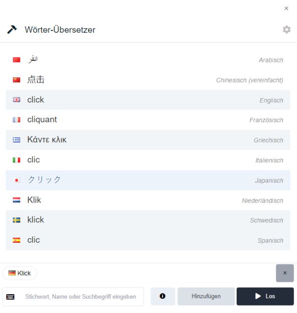
NameRobot shows the translation of individual words in parallel in different languages
Another approach, which is in fact more complex and experimental, could be CBML and ComicsML. These markup languages are used to map textual content, panels and their arrangement of comics with XML. Once the content has been marked up in a format-neutral way, you can start your industry-standard journey with your languages.
The graphics in typical comics appear to be clearly defined. Monochrome, or at best objects with a few hard color gradations, dominate. This reduction is partly for historical reasons during production, but is also used intentionally to separate from reality. In technical documentation, we do not want a separation from reality, but a quick comprehensibility and recognition, which is supported by this reduction. Half-tone images are used less frequently as an alternative to pseudo-realistic color gradients. We also often find thick and thin lines to support the plasticity in comics. No wonder, Gestalt laws are universal. In keeping with history, lines in comics often appear hand-drawn. This now digitally generated appearance gives the images dynamism and plasticity and can, for example, convey vibration and shaking if used properly.
Another way of conveying three-dimensionality is to use hard black shadows, which make it clear that a car is just lifting off the road, for example. Isometrics and other parallel perspectives are not found in comics, but due to their dimensional and proportional accuracy in technical illustrations, they are the best method of making it easier for viewers to assign reality to the illustration.
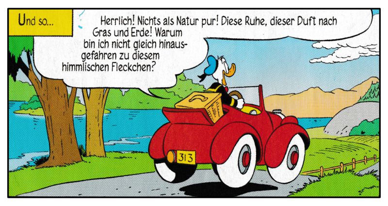
Disney comic, typical representative and classic
(Source: “Donald Duck”, issue 183, Egmont Ehapa Verlag GmbH)
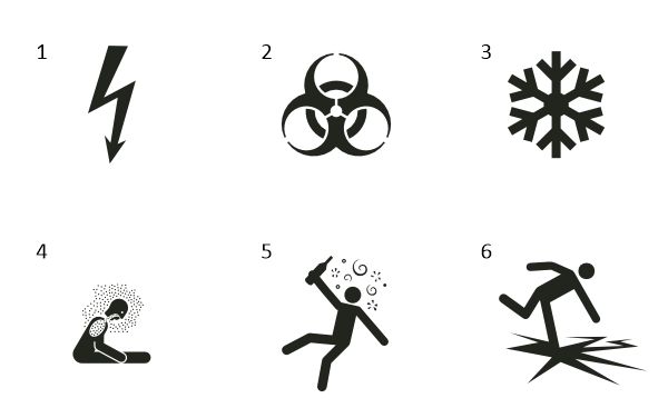
So far for images of the visible world. There are still some open questions, for example object properties. However, we are no strangers to visualizing these, just think of the safety signs of ISO 7010 and the rules of ISO 3864. Yes, these conventions may have weaknesses. But if we apply them systematically and consistently, we can also count on an increasing recognition rate. An essential building block for being understood is precisely the observation of such standardized conventions, here to represent the invisible.
The speedy comic artist uses speed lines to move objects. Many, sometimes diffuse lines that typically indicate the direction of movement on the reverse side. But the possibilities are more plentiful.
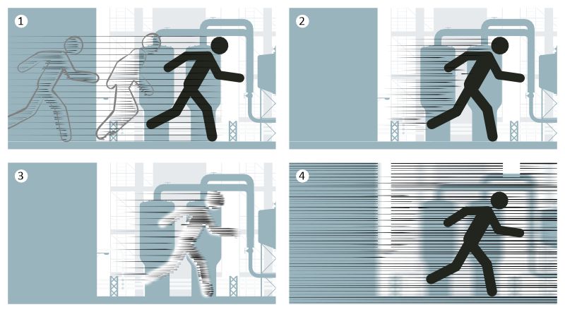
Movement in static images
1 Motion phases
2 Streaks / blurring
3 Motion blur for object (the “camera” is stationary)
4 Motion blur for background (the “camera” moves along)
With such graphic methods, we manage to stretch the moment of a panel and show more than just a moment. Even more powerful is what McCloud calls “blood in the gutter”, by which he means induction. The fragmented scene builds up completely before our inner eye and fills in what is not shown between the panels. These can be objects that are not fully shown, or what has to happen from panel to panel based on experience. While the comic author plays with tolerances in the viewer’s interpretation, technical editors and illustrators must keep this tolerance as small as possible, i.e. the scenes must be close enough together so that the reader is sure to recognize the plot correctly.
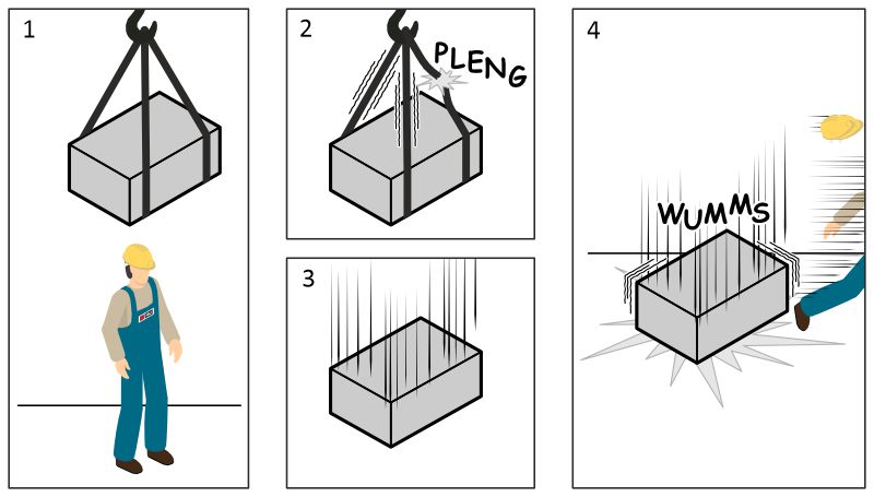
Transferring induction from comics to technical communication in a striking way
In comics, characters are an important tool for providing information between the “lines”. There is, for example, the fable-like use of animals or heroes drawn with a strong character. A way for the reader to identify or differentiate themselves. For us, this means that a person wearing typical work clothing and personal protective equipment is probably a skilled worker. Non-relevant characteristics such as gender and ethnicity are not shown or are underscored in the illustration.
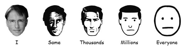
Target group “All”, thanks to Pareidolia we see a face in two dots, a line and a circle
(Source: McCloud, Scott (2001): Reading Comics the Right Way, Carlsen Comics (picture edited))
If the target group is “everyone”, we have to do it like IKEA with Gubbe (Swedish: “man”). A sterilized body and a dot and a line as a face. Fascinating, this is where Pareidolia comes into play, according to which we recognize people in the simplest patterns, for example faces. Our inner, automatic visual perception of ourselves is very close to a circle with two dots and a line. According to McCloud, this is the mask through which we look. It is only through external perception (other people, mirrors, photos, films) that an individual image is created. It is precisely this that enables us to automatically identify with someone like Gubbe. Even if it can’t be representative, I’ve never seen anyone say that the opening instructions in IKEA have nothing to do with them.
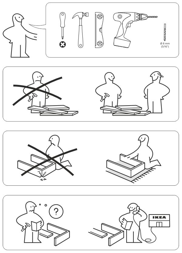
Part of the style-defining IKEA assembly instructions
If we have looked at important style elements so far, they now need to be put together to form a plot. Individual scenes in comics are captured in panels, with a few exceptions represented by a black frame. Simple white space is also possible and has the same separating effect. The key is not the stylistic elements, but the clear separation of the individual scenes. The reading direction corresponds to the reading direction of the language in the panels. If there is no language in text in the panels, the order of the panels must be marked, for example with numbers, letters or, as far as possible, a culturally neutral method with an increasing number of dots. While comics are naturally very creative with panel shape and reading direction, we can support the reader by, for example, making the horizontal spaces between the panels larger than the vertical spaces in order to support the horizontal reading direction. Panel sizes are rarely unmotivated. Longer panels are interpreted as a longer period of time. Yes, a very soft factor. It becomes clearer with stylized clocks or, for longer periods, calendars with torn-off pages. Like us, comic illustrators also face the problem of illustrating details or very large objects and taking the viewer with them. Typically, larger panels are used for large objects and a reference object known to the user is shown in the same panel. We certainly know other ways of bringing small objects into focus, for example, such as magnifying glasses and similar metaphors.
Comics for everyone
But how can we practically adapt comics for our work? Common graphics tools contain a treasure chest of tools for this, often unused because they seem too unserious for our technical content. With a little courage, we can use comic filters in our image editing software, for example. For beautifully rendered objects, color gradients are reduced and displayed in clearly stepped colors or halftone images. If vectors are to be retained, the “Pointillizer” in Corel DESIGNER is a creative tool for producing a halftone effect on a vector basis. Some vector programs contain tools to create parameter-controlled speed lines (for example in Corel DESIGNER “Effect”). Brittle vector lines can be assigned properties that create thick and thin lines and a dynamic brush strokes (Corel DESIGNER “Linear Patterns”). Functional speech bubbles (Corel DESIGNER “Common shapes”) can be found in practically every tool. The technichal communication has already dealt with the efficient visualization of people and hands. In the absence of capacity and detailed know-how, you can fall back on offers on the web that are initially useful in the design phase. At least for the design phase and without the knowledge of a graphics tool, www.storytribeapp.com can also be used. Objects can be intuitively placed in front of industrial backgrounds, text with and without speech bubbles can be used and characters can be customized in great detail. Finally, for more agility, you can create individual comic-style handwriting with calligraphr, for example.
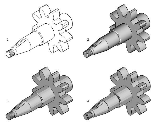
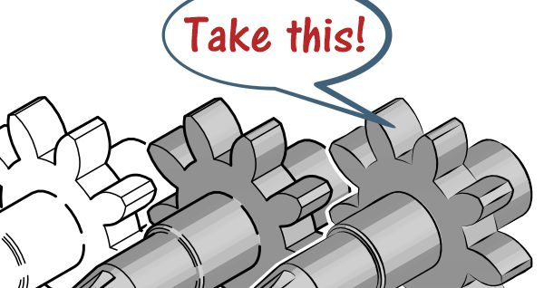
heavy technical illustration to light comic illustration (vectorization from 3D model)
1 Thick-thin line technique
2 Thick-thin line technique with rendering
3 Thick-thin line technique with color-reduced rendering (vector surfaces)
4 Dynamic line drawing (vectors with linear pattern) with color-reduced rendering
Conclusion
Let’s take a step back and look at what we have been given with the medium of comics. The parallels to our information transfer in technical communication are obvious and close. We should rarely allow ourselves to be tempted to present instructions in an absolute comic style, as there is a risk of the lack of commitment mentioned above. But we can always use the functioning conventions from comics and adopt well-functioning conventions even more than before.