Topics
History of a symbol
2020-08-06
The environmental engineer, Charles Baldwin, took on the task of standardization in 1966. So far so good, nothing unusual. Since safety symbols have been used, they naturally have to be developed. Usually, the attempt is made to work with simplified representations of real objects or situations, or if unavoidable, with familiar metaphors. Just what to do if there is no generally known visual equivalent of the danger? Mr. Baldwin did the following:
ISO 7010-W009
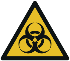
Biohazard warning
Symbol development
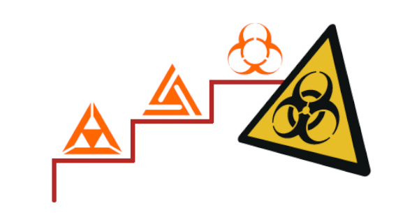
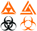
- First, graphic designers were commissioned to design symbols that were unique and easily recognizable, but meaningless.
- These symbols were mixed with the previously used symbols and well-known symbols such as the Texaco star and the Shell Oil logo.
- The symbols were tested nationwide. The respondents were asked to name possible meanings for each symbol that come to their mind when looking at it (association test).
- The symbols to which the least or no meanings could be assigned were again mixed with commonly known symbols and the same persons were asked again by the association test which symbol they could remember.
Result
The result was the most recognizable symbol, which could be confused least with other symbols and their meanings. This was a consistent approach, which was necessary, since in the human imagination there is no real pictorial equivalent for biohazard. After the decision for the symbol known today, it had to be put into circulation and had to go through various approvals up to the National Institutes of Health. Meanwhile it has been standardized in ISO 7010 as W009 “Biohazard Warning” and has been adopted in many national standardization systems. Originally the symbol was bright orange. Mr. Baldwin’s symbol and the process of its creation is well done, because the symbol for biohazard is almost universally known, but this is probably also due to its international standardization and use.
One thing is certain, at some point everyone had to learn the meaning of this symbol. This is made easier by its uniqueness and recognizability.
Source: New York Times Magazine November 18, 2001
Annotated
I find it hard to imagine that the graphic designers actually worked without a known context and the default for position independence. Because not only the result, but also the designs are independent of position and look dangerous even without the later warning triangle.

Mr. Baldwin proved to be systematic and far-sighted, but he did not have a sense of humor. He resolutely rejected a gift tie with small Biohazard symbols, because the symbol was not meant for something like that.

Remarkable is the website of the National Institutes of Health ( as of 2017-11), where a symbol is shown casually, which does not quite match the content and form of the currently standardized symbol. Beyond that, there is nothing more to be found on the NIH website about the Biohazard symbol.